Components

Style guide

Colours, type, buttons and components, in Nzinga colours. The full Nzinga design system lives on its own site.

Colours

Left half light mode, right half dark mode. Every swatch reads its live variable, so the Nzinga skin's values show here exactly as the site uses them.

Base/Black
LIGHT #0B0B10 · DARK #F7F7FA
Base/White
LIGHT #FFFFFF · DARK #0B0B10
Accent/Primary
LIGHT #5C7A00 · DARK #C8FF2E
Accent/Deep
LIGHT #4A6200 · DARK #E2FF94
Accent/Soft
LIGHT #F3FFD6 · DARK #262F0B
Accent/Muted
LIGHT #C8FF2E · DARK #5C7A00
Neutral/50
LIGHT #F5F5F7 · DARK #121216
Neutral/100
LIGHT #EDEDF1 · DARK #18181D
Neutral/200
LIGHT #DEDEE4 · DARK #26262D
Neutral/300
LIGHT #CFCFD7 · DARK #303038
Neutral/400
LIGHT #B3B3BD · DARK #3E3E47
Neutral/500
LIGHT #9A9AA5 · DARK #70707A
Neutral/600
LIGHT #7A7A85 · DARK #8C8C96
Neutral/700
LIGHT #55555F · DARK #9A9AA1
Neutral/800
LIGHT #2A2A31 · DARK #C9C9CF
Neutral/900
LIGHT #17171A · DARK #E4E4E8
Surface/Inverse
LIGHT #0A0A0B · DARK #0B0B10
Feedback/Error
LIGHT #D64545 · DARK #FF7A7A

Typography

Each sample uses the live class named under it. Sizes are desktop values; tablet and mobile sizes step down per breakpoint.

Heading/Display
Geist Regular · 104px
.heading-style-display
Your voice, paid.
Heading/H1
Geist Regular · 80px
.heading-style-h1
Your voice, paid.
Heading/H2
Geist Regular · 56px
.heading-style-h2
Your voice, paid.
Heading/Section
Geist Regular · 40px
.heading-style-section
Your voice, paid.
Heading/Number
Geist Regular · 64px
.heading-style-number
Your voice, paid.
Heading/H3
Geist Medium · 26px
.heading-style-h3
Tokenizer, network and app on one protocol.
Heading/H4
Geist Medium · 22px
.heading-style-h4
Tokenizer, network and app on one protocol.
Heading/H5
Geist Medium · 18px
.heading-style-h5
Tokenizer, network and app on one protocol.
Heading/H6
Geist Medium · 16px
.heading-style-h6
Tokenizer, network and app on one protocol.
Body/Large/Regular
Geist Regular · 18px
.text-size-large
Tokenizer, network and app on one protocol.
Body/Regular/Regular
Geist Regular · 16px
.text-size-medium
Tokenizer, network and app on one protocol.
Body/Small/Regular
Geist Regular · 14px
.text-size-small
Tokenizer, network and app on one protocol.
Body/Tiny/Regular
Geist Regular · 12px
.text-size-tiny
Tokenizer, network and app on one protocol.
Badge
Geist Mono Medium · 12px
.text-style-badge
Tokenizer, network and app on one protocol.

Buttons

Primary, Primary Small, Secondary and Secondary Small for light surfaces. Ghost and Ghost Small are outline buttons for dark sections. Each opens the full Nzinga design system on its own site.

Components

Chip · Icon tile
FAQ Item

Is my voice used without my consent?

No. A recording is used only as its speaker chose, and anyone who has not consented is excluded. Withdrawing is never more than two taps away.

Which languages can I record?

Any language you speak. Pickers list your own languages first, then alphabetically.

Release row · Feature row · Security cell
NOV 3
NEW · TOKENIZER · V2
v2 benchmark results
→

Consent

Every speaker in a recording makes their own choice, recorded.

Hashing

Contacts hashed on the phone, never stored.

Benchmark Row
Swahili token premium
Nzinga
1.35x
Best other
1.49x
Difference
8.4% fewer
Zulu token premium
Nzinga
1.47x
Best other
1.71x
Difference
13.4% fewer

Section components (Benchmarks, CTA panel, CTA Terminal, Closing Split, Lottie card) are full-width and live on the pages that use them: Home 2, Home 3, Tokenizer, Network and App.

Forms

Native form elements with the shared classes field-label, field-input (combos is-select, is-textarea, is-error, is-disabled), form_consent and form_checkbox. Forms on this site send nothing.

Nothing sent.
This form sends nothing. Contact us through GitHub instead.
Something went wrong.
Nothing was sent. Contact us through GitHub, where we read issues.
Success message
Nothing sent.
This form sends nothing. Contact us through GitHub instead.
Error message
Something went wrong.
Nothing was sent. Contact us through GitHub, where we read issues.

Pixel icons · 18

Shown at 1.5x, with the template's blue turned to Nzinga magenta. Each icon is an SVG asset set through Icon tile, Feature row and Security cell.

Pixel / Routing
Pixel / Fallback
Pixel / Cache
Pixel / Regions
Pixel / Streaming
Pixel / Sandbox
Pixel / Tools
Pixel / Approvals
Pixel / Replay
Pixel / Evals
Pixel / Graders
Pixel / CI gate
Pixel / Isolation
Pixel / Encryption
Pixel / Access
Pixel / Retention
Pixel / Data
Pixel / Observability

Pixel Lotties · 4

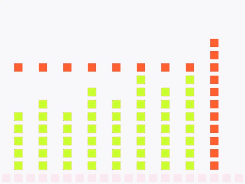
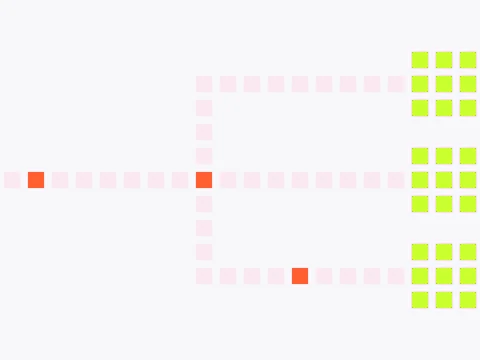
Stills of the four Lottie animations, recoloured for Nzinga. Each has a light and a dark file; the pages that use them are Home 3, Tokenizer, Network and App.
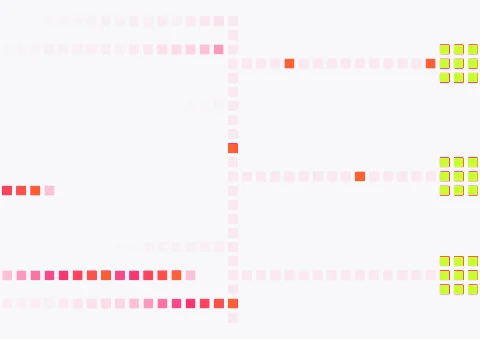
Hero animation still in Nzinga colours: pixel blocks moving between nodes
Hero routing
Tokenizer animation still in Nzinga colours: a request moving through pixel blocks
Tokenizer route
Network animation still in Nzinga colours: a run inside a pixel container
Network flow
App animation still in Nzinga colours: pixel columns rising to a score
App score

Radius

16, 24 and pill are Base Collection variables (Radius/Small, Radius/Default, Radius/Button). 6, 10 and 20 px are set on the classes that use them: tags, icon tiles and inputs, cards.

6 px
10 px
16 px
Radius/Small
20 px
24 px
Radius/Default
Pill
Radius/Button